This essay was written by the ART21/CUE Writer-in-Residence in conjunction with the exhibition Beverly Fishman: DOSE, curated by Nick Cave, on view at CUE Art Foundation, February 23–April 15, 2017. This text is included in the free exhibition catalogue available at CUE.
From inside the pillbox, Beverly Fishman chooses her favorite colors with a calculating eye. A master color theorist, Fishman explores the allure of intoxication—the fluorescent highs of addiction and sickly flesh tones of withdrawal. With her vivid and enticingly colored pills, Fishman formulates a response to the role of aesthetics within the pharmaceutical industry. She appropriates the visual vocabulary of post-industrial minimalism to delve into the psychology of addiction. For an addict, the subtle yet familiar color, shape, and packaging of pills can trigger a biological response, a craving for the next fix that soon morphs into a twisted sense of brand loyalty. As a result, prescription drugs like Oxycodone, Demerol, and Vicodin maintain a cult following, which leads us to an essential question raised by Fishman’s work: What turns the consumer into the consumed?
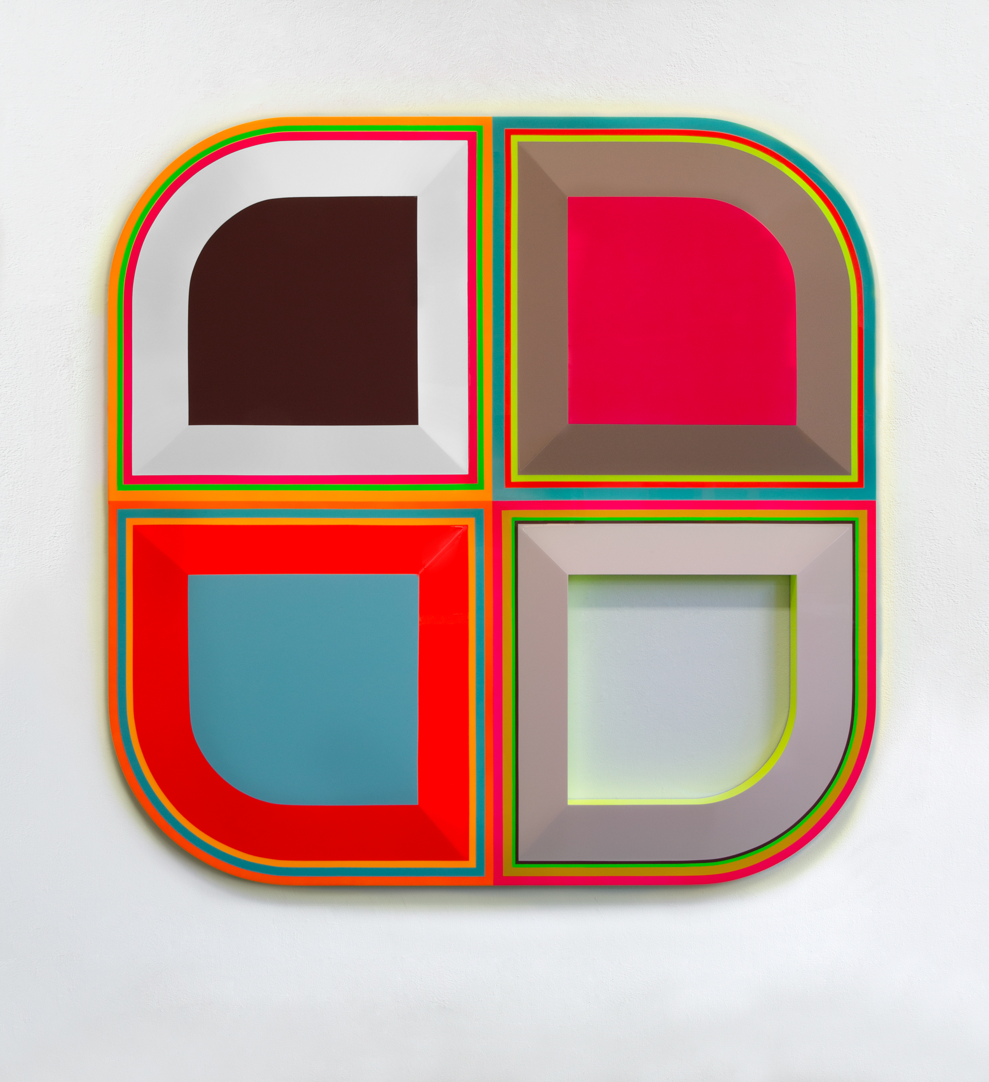
Fishman wants us to explore the nexus between medical and visual conditioning. What are the sensory responses leading to addiction, and how are they hardwired in the human brain? Works such as Untitled (Opioid Addiction), exemplify the artist’s vibrant color palette—bright, ecstatic, and neon. Fishman replicates the colors used in advertisements to catch the viewer’s eye. First responses to these colors bring obvious associations. Neon yellows and hot pinks are filled with electricity, a symbolic nod to the highest highs of stimulants. Electric blues and bright greens have a calming effect that visually mimics that of anti-anxiety drugs. Where Fishman excels is in restraint, for the brighter colors are often relegated to the outlines of her pill sculptures. As a practitioner of color theory, she is recalling the lessons of Modernism and Minimalism, exercising restraint for maximum effect. The neon colors she uses are like candy coding for her pills, hiding darker cores that represent the sinister side of addiction and withdrawal.
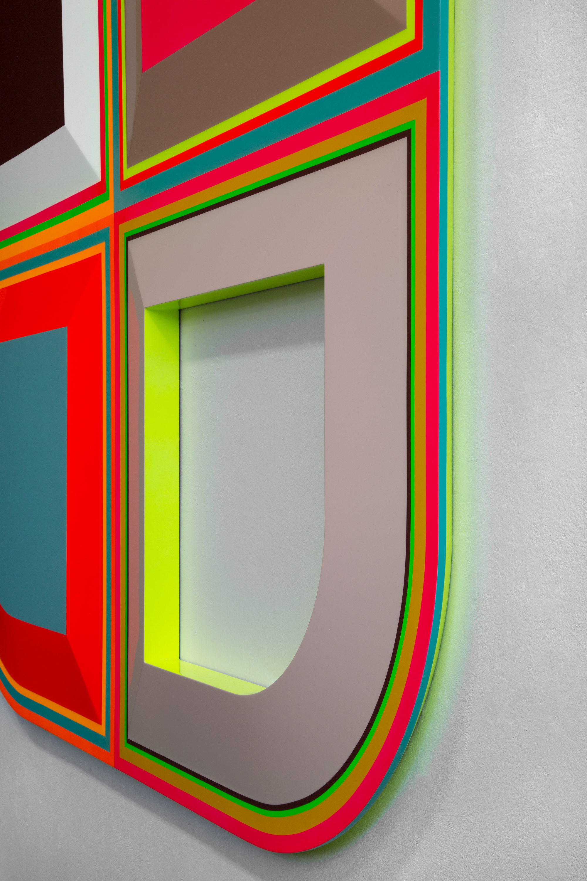
Unlike the colors in the pills she seeks to represent, Fishman’s are not synthetic. Harkening back to the apothecaries of yore, Fishman crafts her pills from scratch, choosing her fluorescent colors based on luminosity and contrast, while working in the painterly tradition of artists mixing their own colors. Evoking the minimalism of Josef Albers, Fishman believes in the power of color as an illusory force. The balancing of color and shape is a perfectionist’s endeavor, and Fishman applies her passion for exactitude to parallel the dosage requirements of many pharmaceuticals; she captures the action of splitting pills by dividing her sculptures into quarters and halves. Untitled (Anxiety), for example, uses its four parts to explore the subtle shades between pink and white. Resembling an optical illusion, the juxtaposition of slightly different shades allows Fishman to play with the viewer’s eye, capturing the sensation of seeing a color change a shade lighter or darker before our eyes.
With the right concoctions, Fishman imbues her work with such vibrancy that her pills envelop viewers into her aesthetic world. The luminescent effects she creates echo her longstanding interest in glow paint, as in her earlier glow-in-the-dark ecstasy pills. On the edges of her sculptures—as viewed in Untitled (Anxiety)—and in the empty spaces of pills like Untitled (Opioid Addiction), Fishman allows her sculpture to glow, coating the gallery’s white walls with a wash of color. Here, the artist paradoxically fills a void with nothing, nothing but the slightest suggestion of color—photons invisibly bouncing off a hard surface. Formally, Fishman recalls Mark Rothko and his own investigation of color’s ambiguous relationship with space. In a Rothko painting, color repeatedly unseats itself in the picture plane, shifting between foreground, background, and middle ground. Adapting this idea to wall sculpture, Fishman’s atmospheric pigments test depth in a three-dimensional space, deconstructing through optical illusions our belief that color is a flat phenomenon.
More symbolically, the faintness of the glow hints at a dulling of the senses or shift in perception like that experienced by a drug user. The colorful haze suggests the correlation between biochemistry and color, reminiscent of ancient alchemy, a Greco-Roman precursor to modern medicine. Following a crude Aristotelian system called the four humors, soothsayers composed a complex dialectic aimed at connecting physical and mental illnesses with imbalances in bodily liquids; in turn, those liquids came to be associated with colors, especially dark green, red, yellow, and a murky blue. Through the signifiers of color, the doctor would prescribe treatment. We see the legacy of this system today in the tones we associate with sickness. At the center of Fishman’s pills are many of the colors mentioned above, along with black, an obvious signifier of death. These colors exert a gravitational pull, sucking up the light radiating from the pills’ coated edges. By tapping into the visual history of medicine, Fishman obfuscates the division between the corporal and the pharmaceutical. She successfully implicates what is at stake in an unchecked medical industry: our bodies.
For pill-takers, the fear of unknowingly ingesting dangerous drugs is very real. It underlies society’s overall distrust of the drug industry. Who is to say which specific chemicals in a drug are safe and which are not? How could average consumers know if they are swallowing a placebo or the real thing? Fishman questions the reliability of pharmaceuticals by addressing the mysteries of internal medicine. Even when a capsule is split in half, it reveals nothing about the actual contents of its curatives—all we see is a chemical dust. The dull monochrome tones of real pills belie their ability to alter the brain’s chemistry. This irony is not lost on Fishman who relays the divide between manufacturer and consumer. Similar to her color palette’s industrial look, Fishman’s pills themselves are finished with a glossy, plastic sheen. This is yet another red herring, an effect that might lead you to believe her work is mass-produced in an off-site factory. Again, Fishman has deceived us, masking the meticulously chosen shapes and finished woods she uses for her sculptures. Without a trace of natural material, Fishman’s pills refashion Donald Judd’s preference for anonymous industrial objects into a criticism of the pharmaceutical industry’s secrecy—or more acutely—the mystery inside a pill’s capsule.
Even when she splits the pills, as in Untitled (Alcoholism), Fishman does not spill their specific contents; she does not detail their specific chemical components or brand names. Instead, she uses the lessons of minimalist abstraction to ask: What are we actually consuming? By alternating between bright and actual bodily hues, Fishman paints what the pharmaceutical industry would rather hide: medicine as risk. The central divide of Untitled (Alcoholism) sees an explosion of color that candy-coats the pills’ somber black and blue cores with a rapid succession of electric colors. The dark interiors of Fishman’s pills foster a contrapuntal sense of curiosity and dread that matches the short-term highs of drug abuse with the long-term lows of addiction.
Fishman draws attention to one of America’s most insidious epidemics: prescription drug addiction, approaching it in a non-histrionic way from the perspective of an artist and art historian. She explores color’s relationship with medicine and delivers a visual code for addiction through the language of Modernism, through which she offers her viewers an access point into the psychology of addicts and the Big Pharma companies that make them.
----
The ART21/CUE Writing Fellowship provides each writer with a mentor, an established art critic appointed by the International Association of Art Critics USA Mentoring Committee. Zachary Small worked with the editor, Barbara MacAdam.
Zachary Small is a New York-based genderqueer writer and creator. As an art critic, he has written for many publications including: BOMB Magazine, Hyperallergic, ARTINFO Magazine, and HowlRound. As a theatremaker, he has premiered work at Dixon Place, La MaMa ETC, and Off-Broadway.